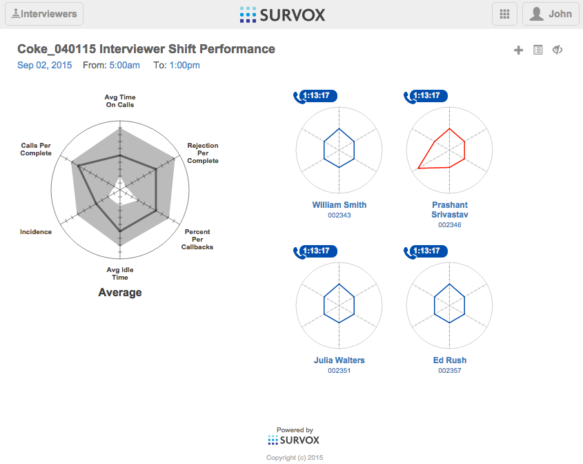
Interviewer Shift Productivity Chart
The Interviewer Shift Productivity Chart is intended to provide metrics of interviewer productivity on a particular study over a user-defined timeframe (i.e. the shift). These metrics are presented in the form of a set of spider charts, including a chart representing the average for all of the interviewers on the study over the period under consideration, and a spider chart for each individual interviewer.
Navigation To The Interviewer Shift Productivity Chart
The Interviewer Shift Productivity Chart is represented on the Studies page as a spider chart icon within a given study’s boxed area.
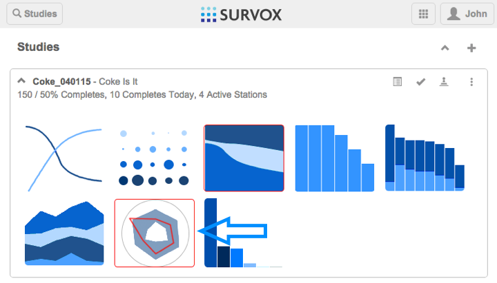
When this icon is clicked, a new tab will open in the browser with the Interviewer Shift Productivity Chart. The time period for the chart will default to the current shift period, defined in the preferences, or to the last shift period, if the current time is outside the shop’s hours of operation.
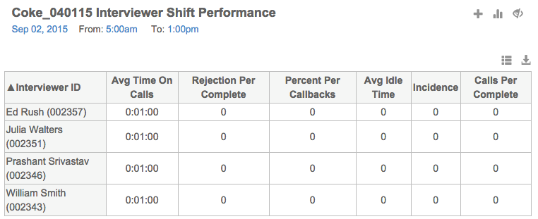
Shift Date/Time
The shift date and time (to and from time) are settable by the user, but default as mentioned, above.
To set the date, click on the date text below the page title, and select the desired date within the date control.
To select a new to or from time, click on the time text and select the desired time from the drop down that appears.
Once the date or time is changed, the charts will update to reflect data covered by the newly defined timeframe.
Average Chart
In the upper left hand of the graph area is a large spider chart that represents the average performance metrics of the team of interviewers for the study.
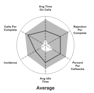
This graph shows labels for each of the spider chart axis, as well as the average line and the expectation range (in gray). If the user moves their mouse over the graph, highlighted vertices will appear on the graph. If the user then moves their mouse over one of these vertices, a tooltip will appear showing the numerical value of this metric.
Interviewer Chart
The spider chart for each individual interviewer contains several pieces of information.
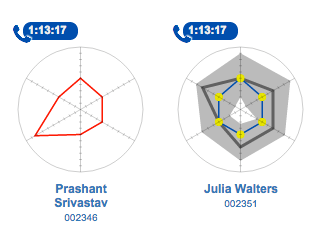
In the upper left of each individual interviewer graph is a status icon and time, indicating the amount of time the interviewer has been in that status.
The spider graph itself represents the six metrics selected for viewing. On mouse-over, the average line and expectation region are displayed in gray for the sake of comparison. Also, yellow vertex highlights are shown, which provide tooltips when touched with the mouse cursor. These tooltips provide the axis label and numerical value of the metric under consideration.
Below the spider chart is the interviewer name and ID. When the user clicks on the name/ID, a new tab is opened in the browser showing full detail regarding the interviewer in question. (Note: this Interviewer page has not yet been implemented. We are also considering showing a toolbar on the spider chart on mouse-over and a right-click menu.)
Add Interviewer Button
To add an interviewer to the study from the Interviewer Shift Productivity Chart, do the following:
- Click the Add Interviewer “+” button in the toolbar in the upper right hand corner of the chart.
- A drop down with a list of available interviewers will appear. Click on the name of the interviewer that you would like to add.
- A spider chart representing the productivity of that interviewer on the study for the shift in question will appear. Note that the interviewers individual chart may be empty, if the interviewer has done no work on this study, yet.
(Note to documentation: This functionality is yet to be implemented in the user interface)
Conceal/Reveal Inactive
To conceal (or reveal) the spider charts of interviewers who are currently not on duty, press the Conceal/Reveal button in the toolbar in the upper right hand side of the graph.
Interviewers Button
To navigate to an interviewer chart that is off screen, do the following:
- Press the Interviewers button in the upper left hand of the page. A drop down will appear with the names of the interviewers.
- Select the interviewer that you are interested in. The page will scroll so that interviewer’s chart is visible.
(Note to documentation: This functionality is yet to be implemented in the user interface)
Table Button
To view the Interviewer Shift Productivity as a table, press the Table button in the toolbar in the upper right hand side of the graph.
Add/Remove Table Column
To add or remove columns to the table, the user presses the columns button in the table toolbar, and is presented with a checklist of allowed columns.
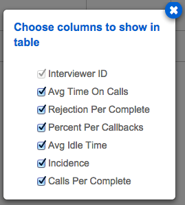
The table is updated as the user selects or removes columns. Once the user is finished making their selection, they close the checklist box by clicking the “x” button in the upper right hand corner.
Change Column Order
To change column order in the table, the user clicks in the heading area of the column to be moved and drags the header to the place where they wish the column to appear, then drops it.
Sort Table by Column
To sort by a column, the user clicks on the column heading. To reverse the sort order, the user clicks the column heading a second time.
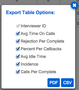
Export to CSV/PDF
To export the table, click the Export button in the table toolbar. A popup containing a columns check list will appear. Once you have selected the columns that you wish to include in your export, select one of the buttons in the lower right corner of the popup indicating the type of file you wish to export to; PDF or CSV.
Preferences
There is a preferences page for the apps. This page will include several settings used in the Interviewer Shift Performance chart. These include the following:
- Shift times
- Spider Chart Axis
- Spider Chart Axis Expectation Region
- Constant values
- Standard deviations
- Definition of Incidence (TBD)
(Note: The preferences page has not been implemented, yet.)
Support Notes
The back end has not been implemented for the Interviewer Shift Productivity chart. There are several pieces of information, including some of the allowable metrics, which may not currently be tracked in the Survox system. As the backend is implemented, these pieces of information will be documented.
Currently, the chart uses a RESTful API, implemented in Python, which is providing mock data. The intention is to implement code underneath this interface that will pull real information from the Survox system.
In addition to new pieces of information that will be tracked, there will also be new preference values (see, “Preferences”, above). These are almost completely new, as is the user interface for entering this information.